Master Year
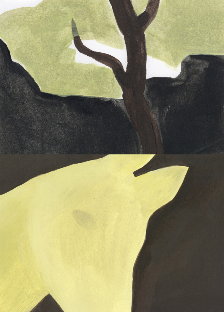
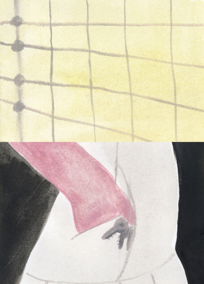
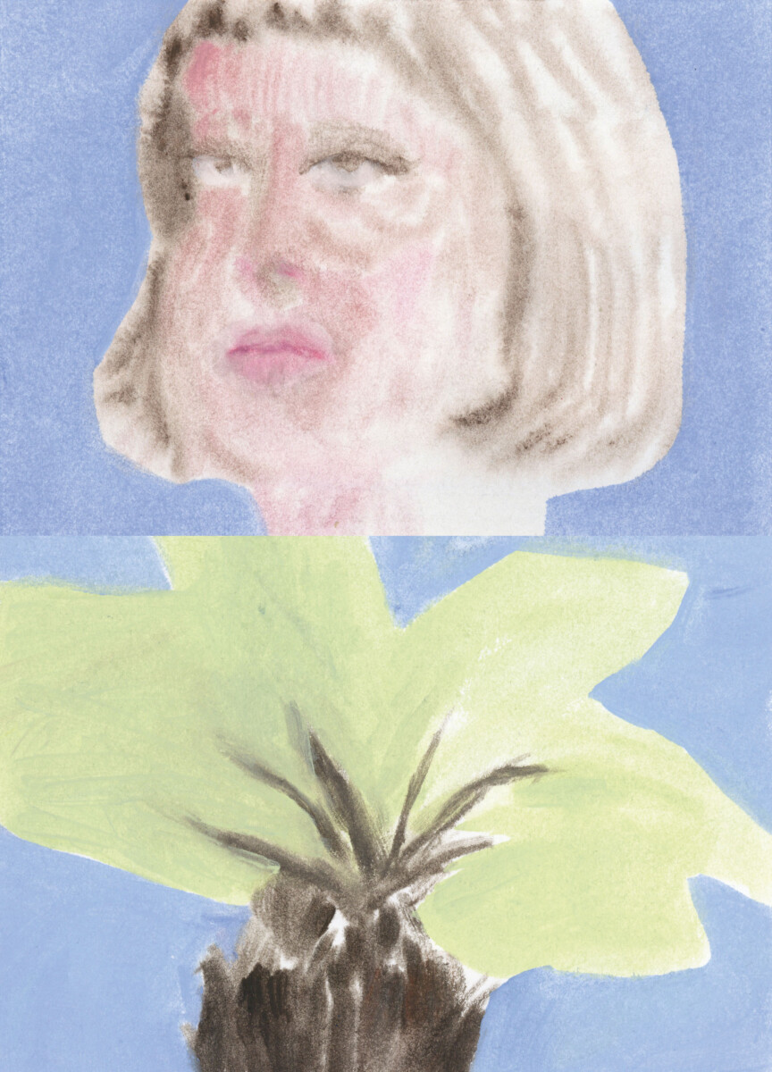
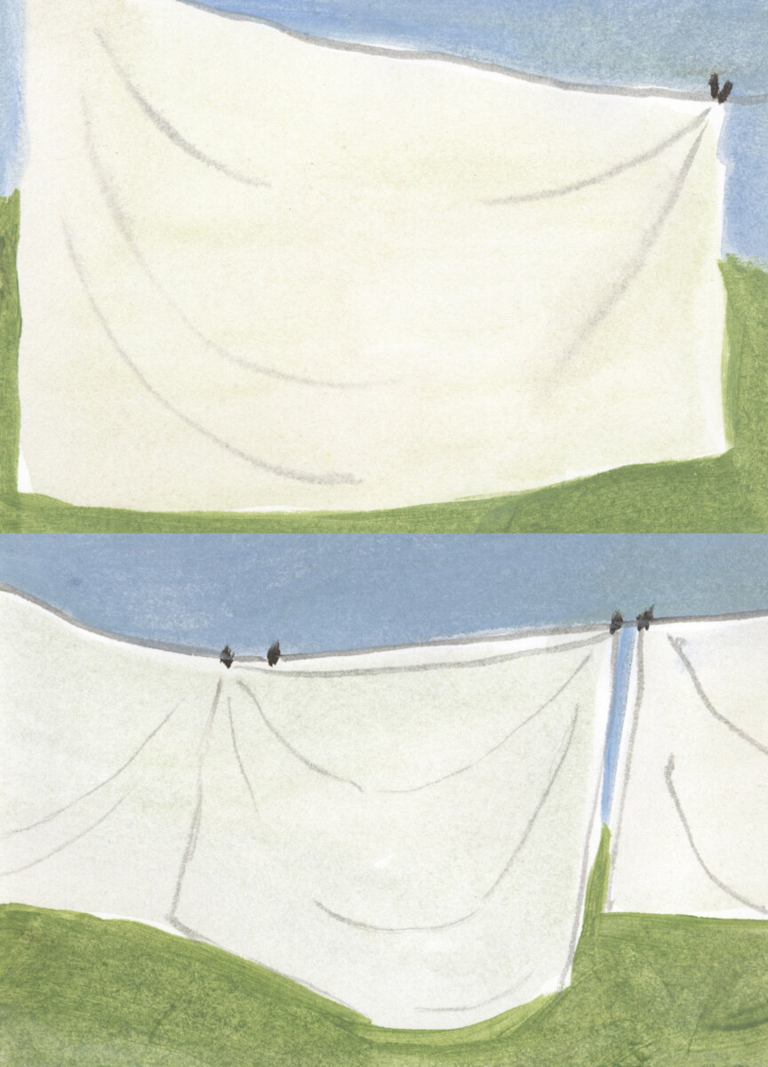
With Master Year, Riet Van Lysebettens presents a wide range of books and works in various formats. Drawing on a selection from the past year, she lays out her creative journey.
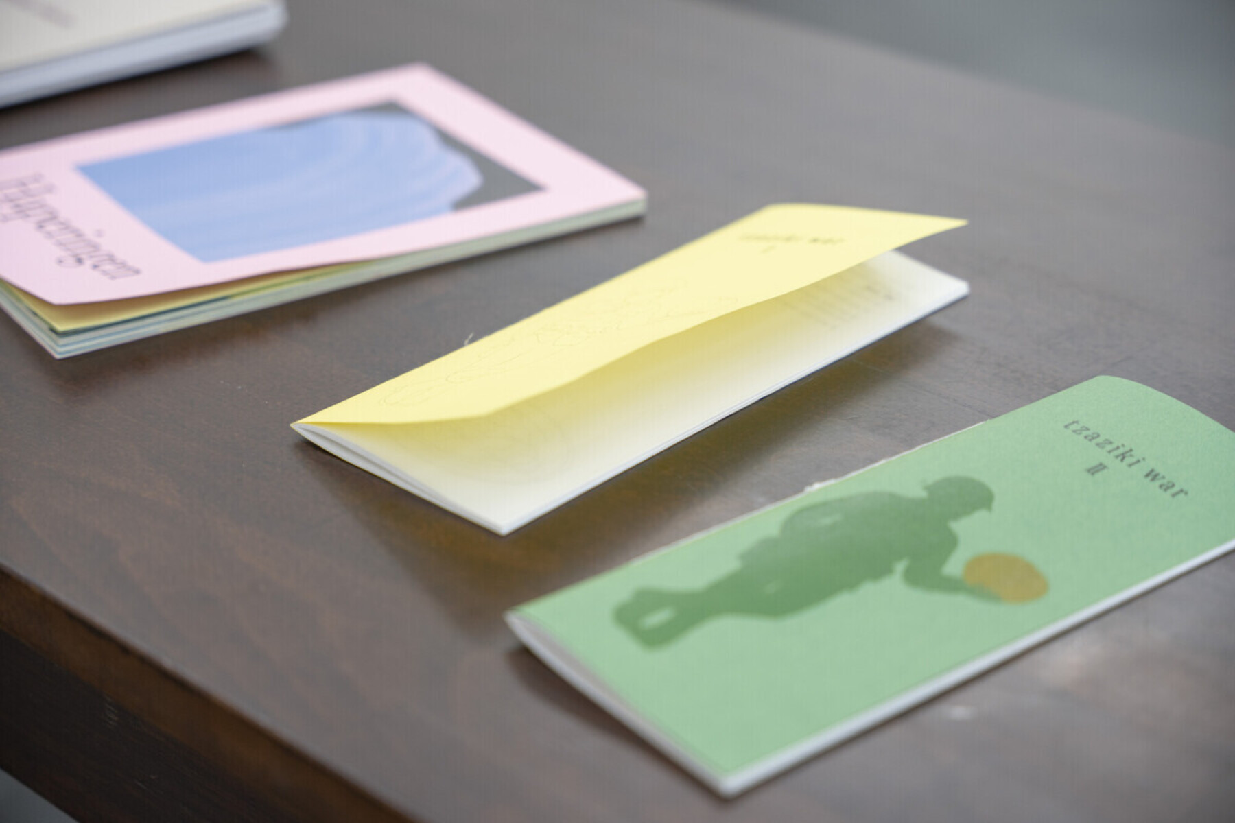
RIET VAN LYSEBETTENS
I’d been looking forward to my final year for so long. It turned out to be a season packed with a whole series of episodes. There was no shortage of ideas; I already had a few that I hadn’t got round to before. During the first semester, I did an internship as a graphic designer at the publishing house Borgerhoff & Lamberigts. During that time I came up with a host of new projects.
Tzatziki War
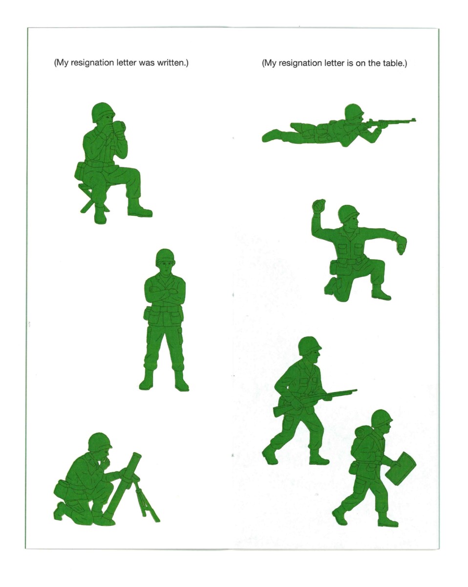
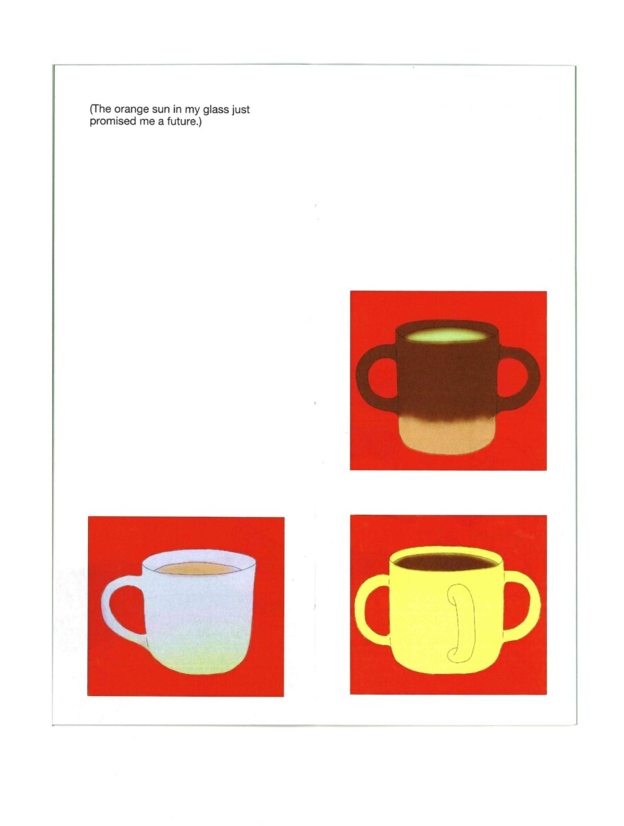
One of the works I’d already had in mind last year was Tzatziki War. Across two books, they describe the little wars fought at the kitchen table. In the first, the main character is stuck at the table.
In the second, he breaks free and seeks out his own rules. I began the publications with an epigraph by Sun Tzu, a famous general who is now mainly quoted in management courses. I knew straight away that each book had to take the form of a menu and that I wanted to draw toy soldiers. I then filled in the rest associatively.
Cluedo
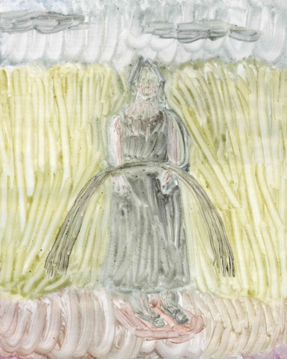
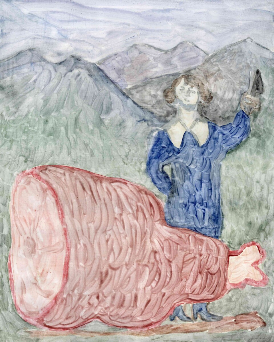
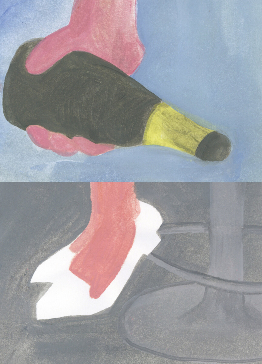
I saw the publication Cluedo as a sort of concept album, similar to those of the music world. That idea came to me when I heard toddler techno on television in Germany. I wrote little verses, rhyming texts. From the game Cluedo, I borrowed the structure person + place + object.
Henrietta in Manhattan is leading the race,
She’s got metal boules and a look on her face.
I’ve made images to go with each text. I’m moving to New York at the end of October. I don’t yet know what I'm going to do there. So the bonus track will be: me with a set of petanque balls and a look on my face.
As I focused on printmaking, I used a watercolour monotype here. Its softness contrasts nicely with the text, which is a bit harsher. I always look for a specific technique for each project. It’s not as though I think: ‘I’m good at painting with acrylics, so I’m going to paint everything in acrylics.’ Even though that would make things easier for me.
Printmaking
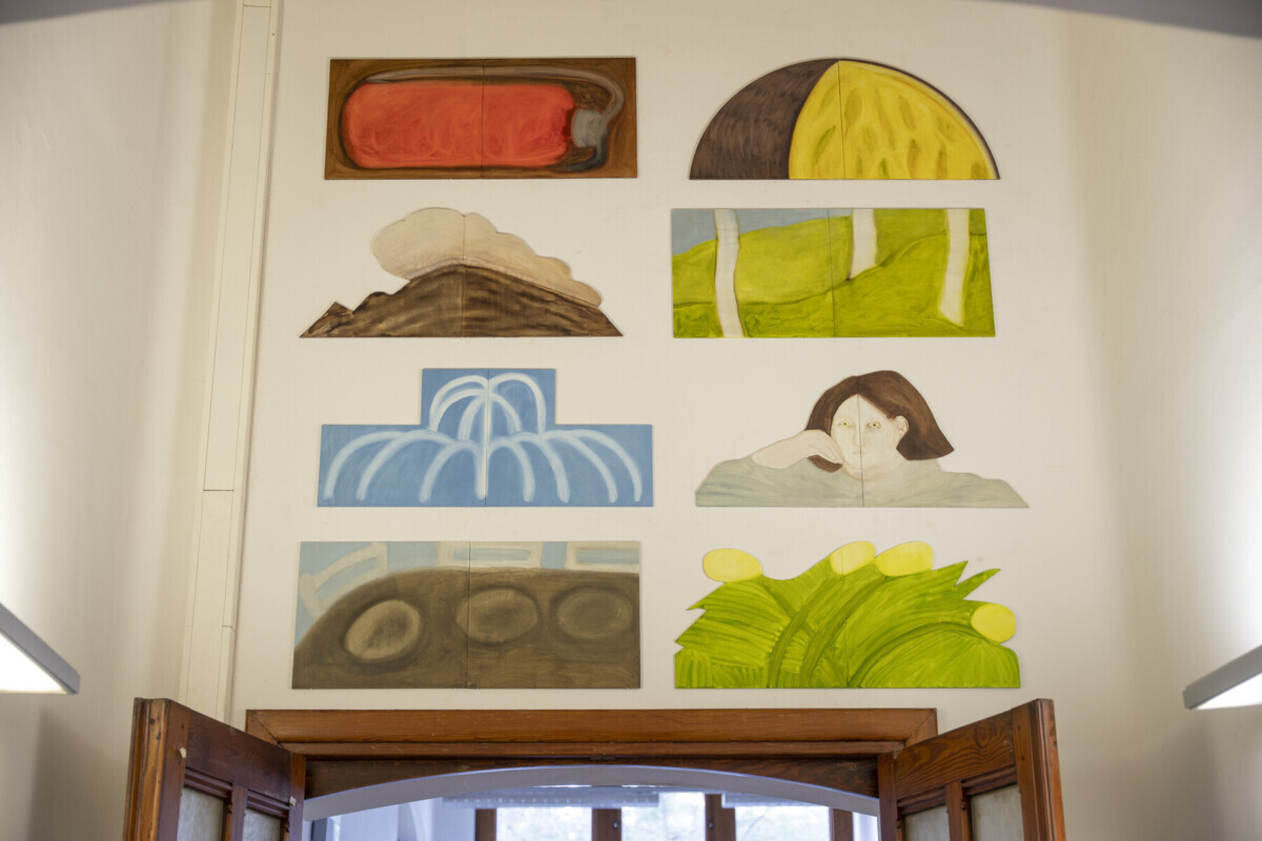
Before I started studying printmaking, I completed a bachelor’s degree in teaching. The focus was on biology and art education. After those three years, I was eager to draw more. Initially, I therefore thought about studying illustration. However, after the first foundation year in graphic design, I opted for the wide range of possibilities offered by printmaking. In the second year, I chose a minor in illustration. My mentor, Martha Verschaffel, is also a teacher for that course. And then, as I mentioned, I did my work placement as a graphic designer.
In printmaking, we studied techniques involving very specific processes. If you occasionally skip a step or approach the work differently, you can quickly adapt them to suit your own style. For example, I used typical viscous printing ink to create monotypes. They look exactly like oil paintings. The ink might well flake off within five years, but that’s part of the experiment.
Frilly Blouse Syndrome
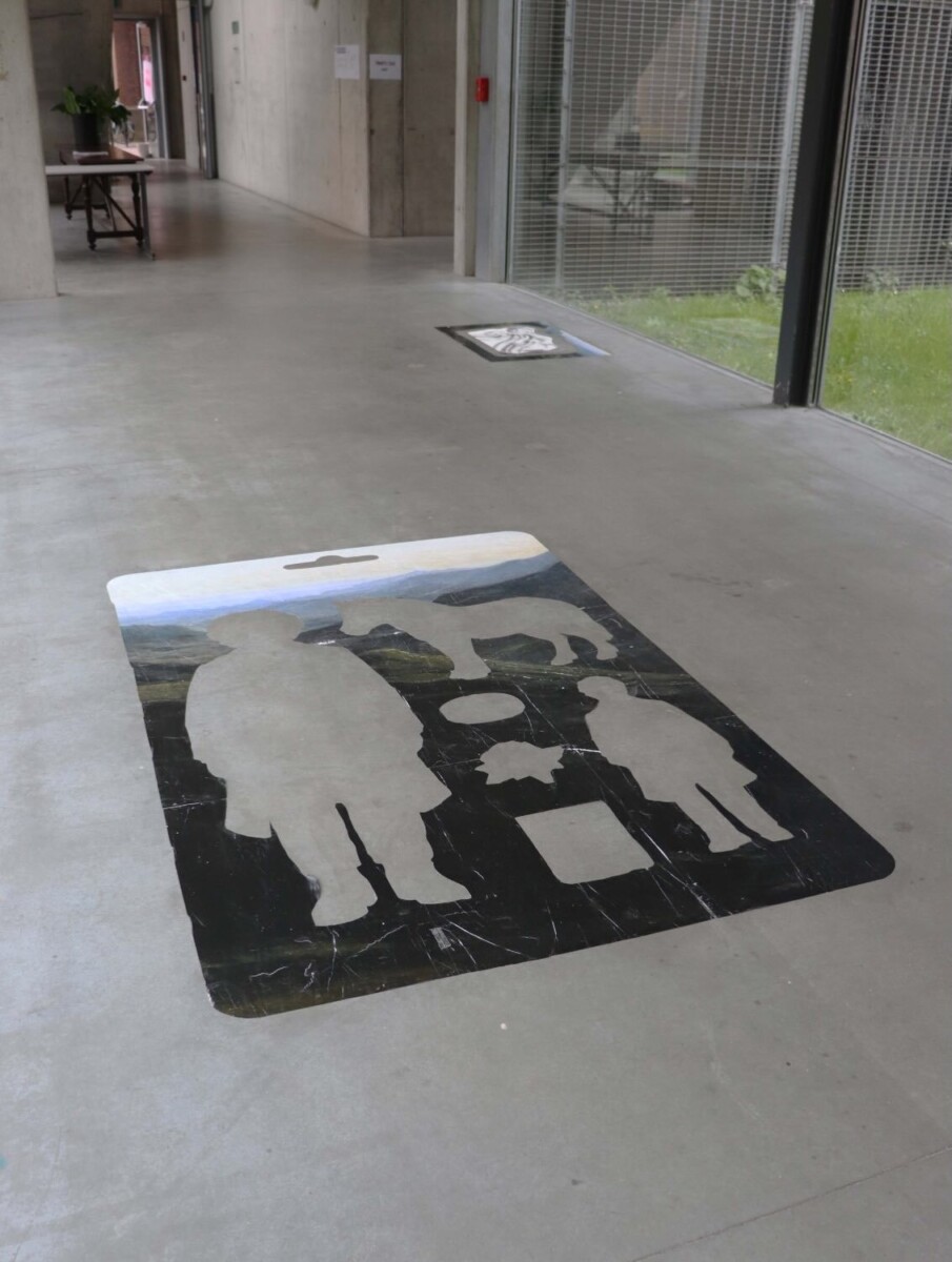
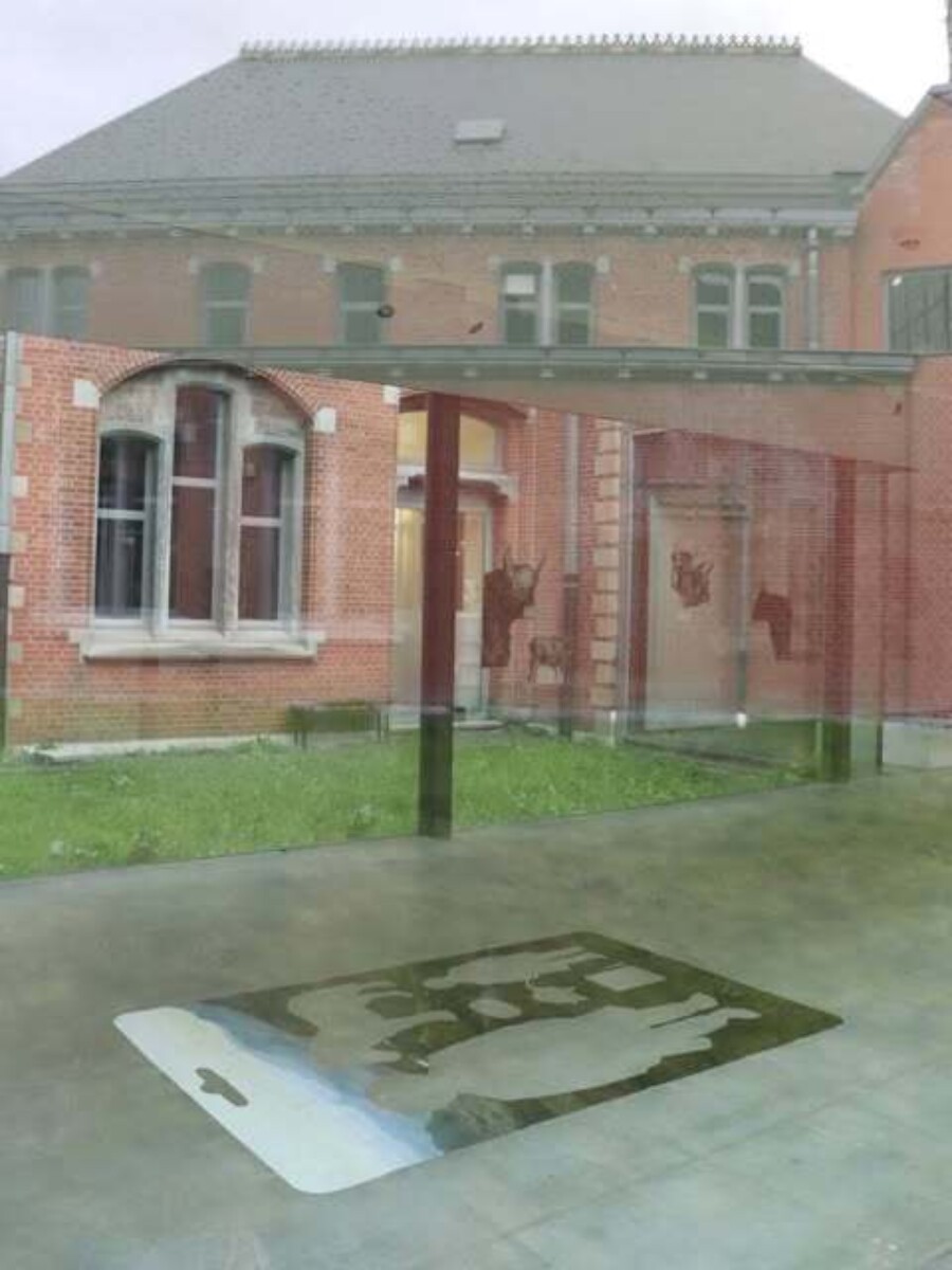
For MAP, I made a work for the floor. Frilly Blouse Syndrome was inspired by Linda Nochlin’s essay Why Have There Been No Great Women Artists? (1971), in which she questioned the visibility of women within art history. For the exhibition, I created a starter pack featuring the 19th-century artist Rosa Bonheur. Passers-by literally walked right over the female artist.
Instructions for a Tuesday
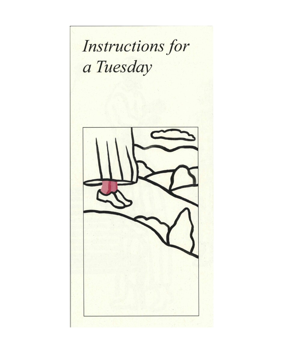
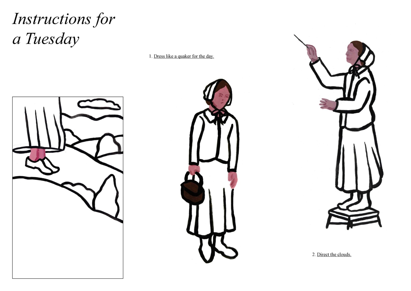
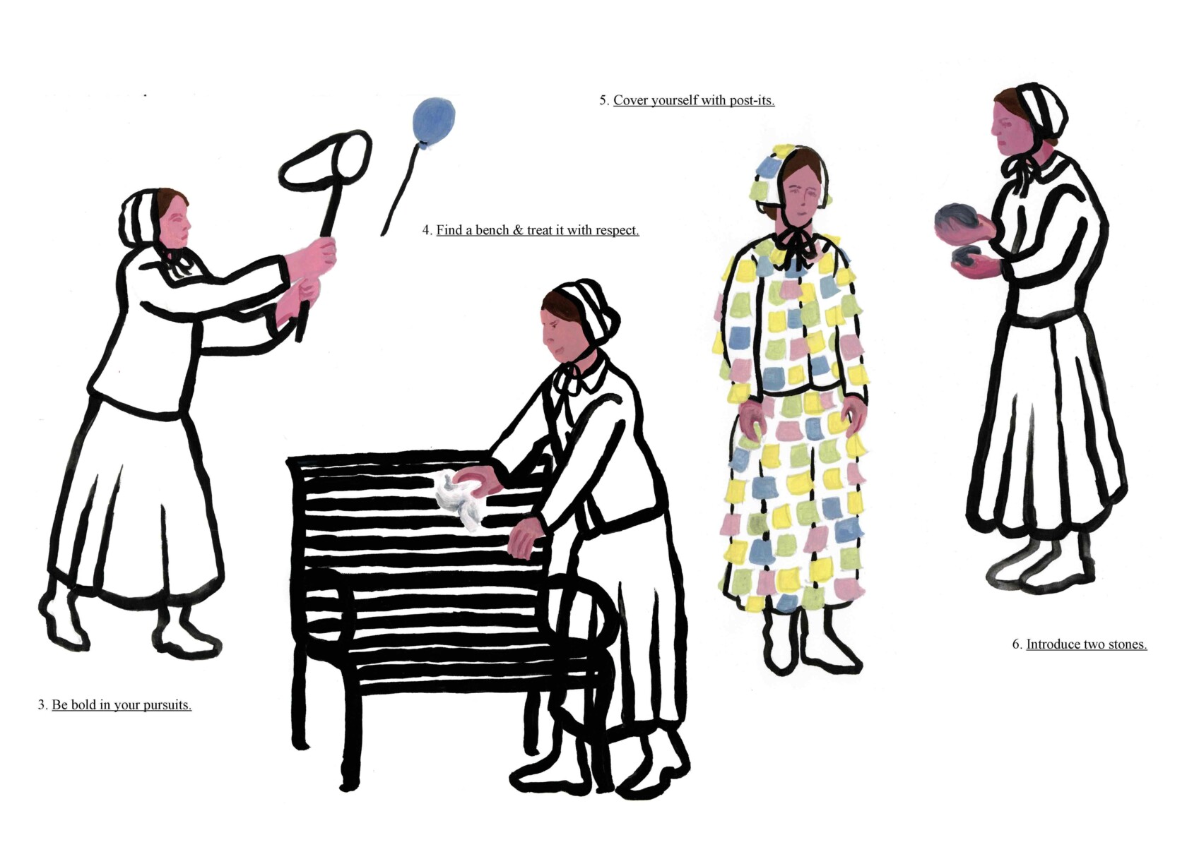
This is a series of meaningless leaflets, such as ‘How to eat soup during a crisis’ or ‘Instructions for a Tuesday’. There’s often humour in what I create, but you have to get it. To me, my work is sometimes very funny, although I can imagine that for most viewers it doesn’t land at all. That said, my jokes are never meant to be offensive — I don’t want to hurt anyone’s feelings.
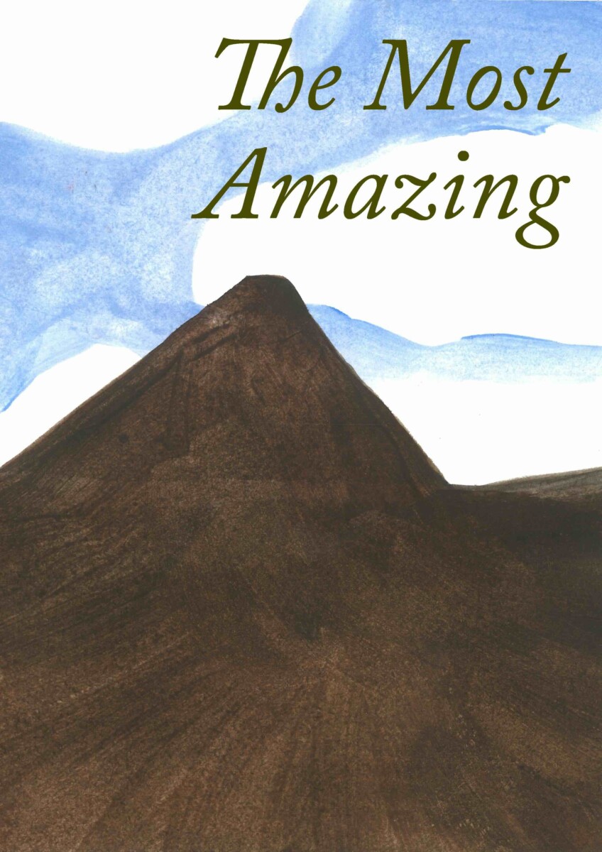
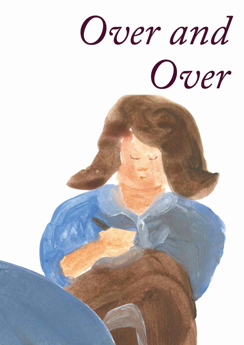
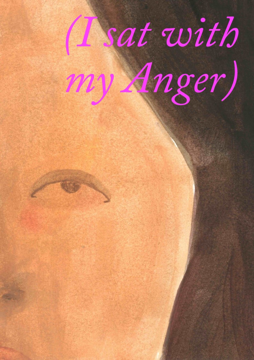
Marguerite, The Worm, […], (I sat with my Anger)
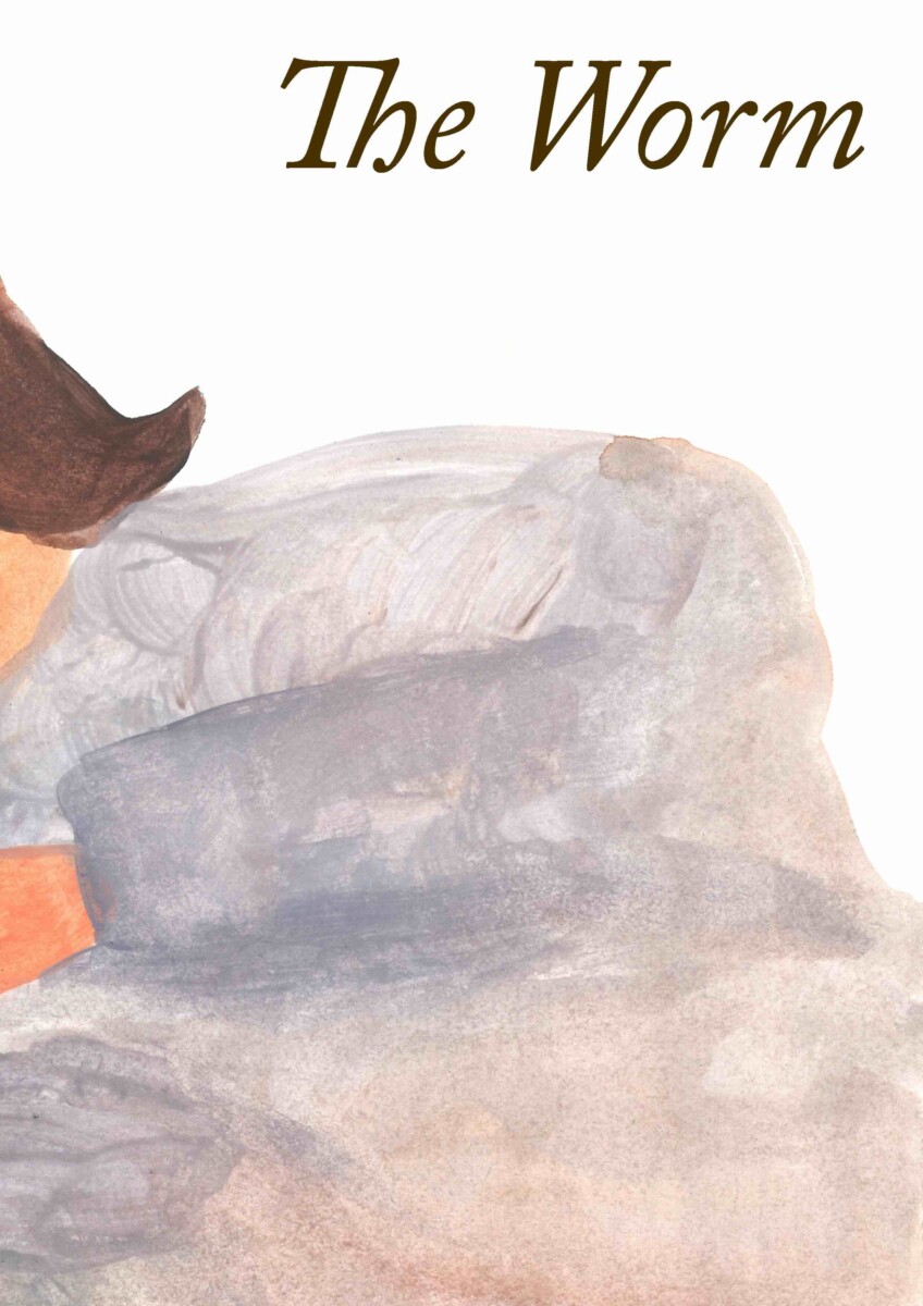
In this series, I used the same images ten times, always in a different order. I gave each publication a different title: Marguerite, The Worm, Pardon, Static, I am withering, Cup of Ambition, As usual, Over and Over, The Most Amazing, (I sat with my Anger). They illustrate how the sequence of events influences your impression of them.
Collective Sigh
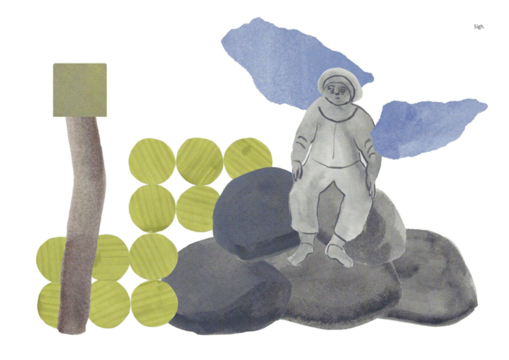
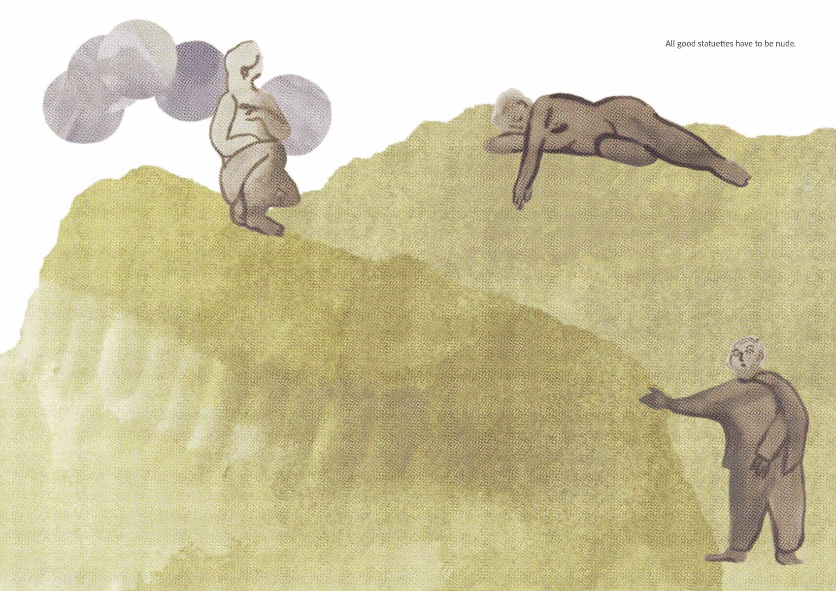
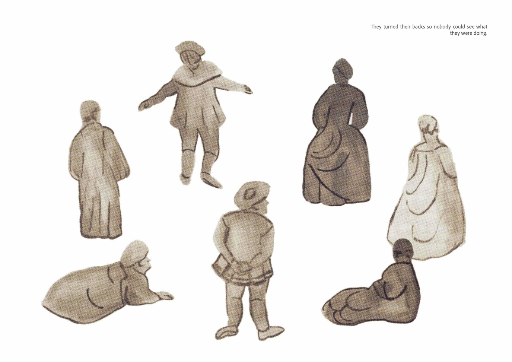
My dad does genealogy. That’s how we discovered that we’re related to Jean-Antoine Watteau, a famous Rococo painter. He was the brother of my great-great-[…]-great-grandfather, many generations ago — my only “claim to nepotism”. The work Collective Sigh borrows figures from his paintings and presents them as statues. As Watteau is family, it felt OK to recontextualise his characters, including his beloved Pierrot.
The Most Romantic Volcanoes
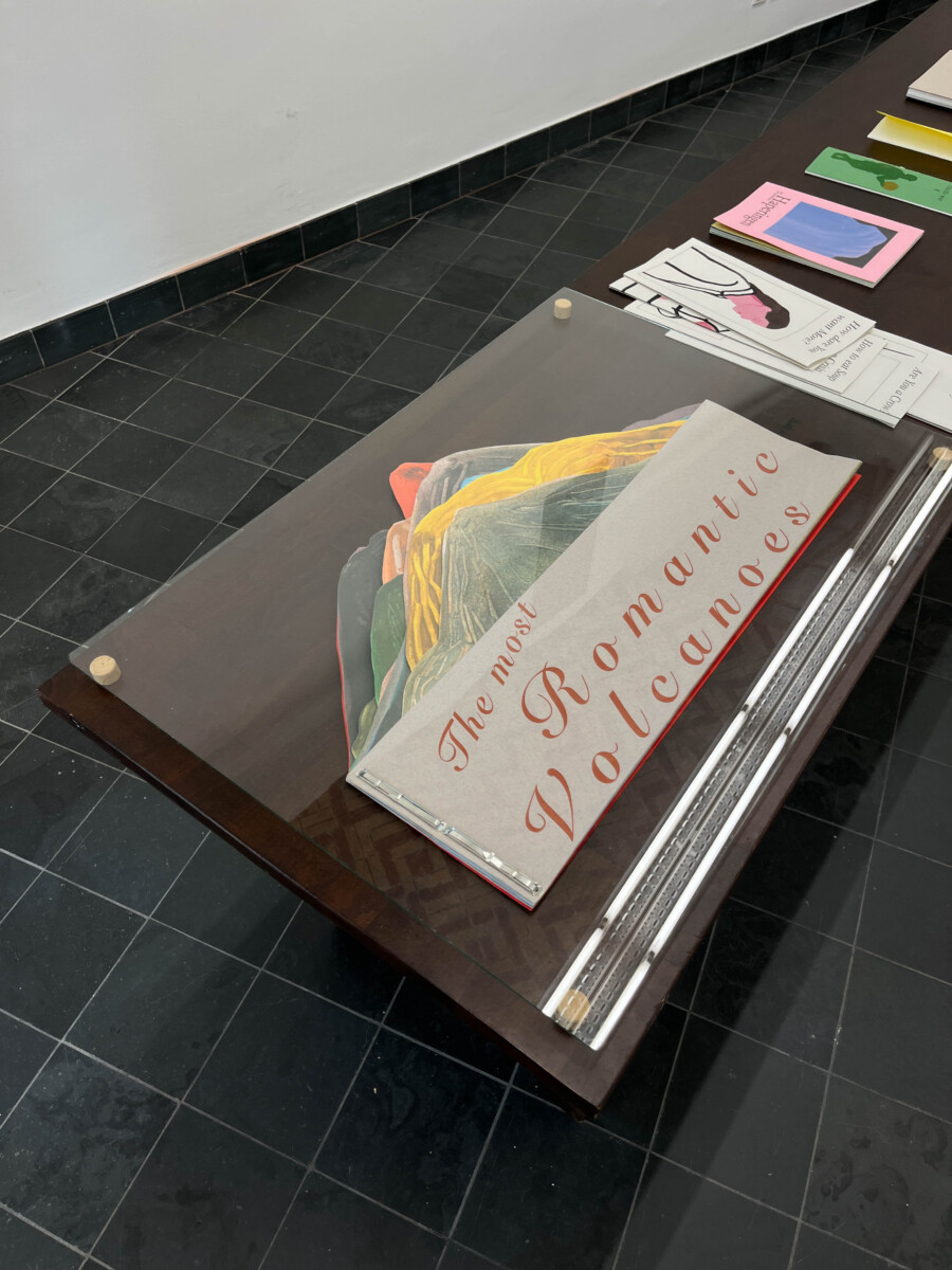
The starting point for The Most Romantic Volcanoes was the 19th-century notion of destruction as the ultimate form of beauty. Take, for example, the Tambora eruption, which influenced the paintings of William Turner. I investigated which volcanoes are mentioned most frequently in literature. I reproduced these, with captions featuring the key words most commonly used to describe them.
One Last Walk
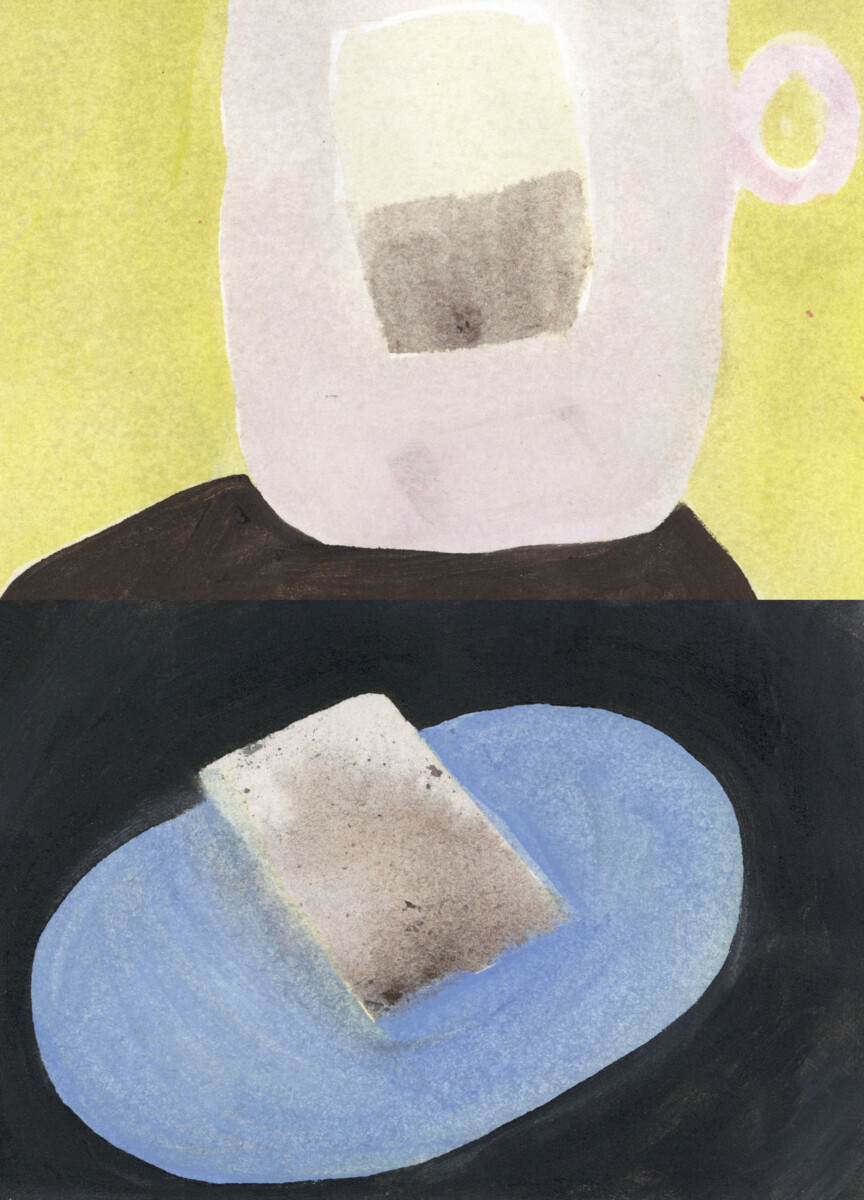
The last publication is more personal. It documents a walk through my home. I zoom in to look at things in a completely different way. In each room, I highlight a single object. And I add short sentences that describe actions in a very detached way. As I’m about to leave for New York, this is my way of saying goodbye to my place.
Henrietta in Manhattan is leading the race,
She’s got metal boules and a look on her face.
text: Arno Huygens
photos: Riet Van Lysebettens (unless indicated otherwise)
 FashioneventAgendaArtistic activities
Fashion students from KASK & Conservatorium present their graduation projects during 2 shows on Campus Bijloke, for the first time in the Gent Jazz tent.
Godshuizenlaan 2
9000 Gent
 ExhibitionexpoAgendaArtistic activities
Spread out over the Bijloke campus, you can discover the work of students in photography, graphic design, autonomous design, fine arts, textile design, fashion, musical instrument making, interior design, landscape and garden architecture, landscape development, digital design and development, curatorial studies, educational master in audiovisual and visual arts and the educational master in music and performing arts.
 film and animationfilmAgendaArtistic activities
Our audiovisual arts master students will project their final works into the world during the avant-premières at Sphinx Cinema on 23 June. Tickets will be available soon.
Later, from 25 to 28 June, we will repeat the films at KASKcinema. Admission is free, no need to make a reservation.
9000 Gent
9000 Gent
 MastersoundsconcertAgendaArtistic activities
Mastersounds is known among connoisseurs as the holy grail of up-and-coming musical talent. During this festival, part of Graduation 2026 at KASK & Conservatorium, graduating students in jazz, pop and music production present their own projects. Between 15 and 25 June 2026, they will shake the foundations of the Minard theatre and De Centrale. They were preceded by Ramkot, Balthazar, Tomàn, Senne Guns, Douglas Firs, Nordmann, Amatorski, Faces on TV, Shht, Yong Yello, Loverman, Iskander Moon... In addition, every year we celebrate the birth of the new Masterworks LP, a compilation album that brings together all that talent. Get your copy at the festival.
Romain Deconinckplein 2
9000 Gent
Kouter 29
9000 Gent
Romain Deconinckplein 2
9000 Gent
 Drama, KASK DramadramaAgendaArtistic activities
During the Drama Festival, drama master’s students present their graduation work. Offbeat and classical drama, crossovers, performances and multidisciplinary work can be seen at various locations in Ghent. The Drama Festival runs from 15 to 20 June 2026.
 Classical music, MIRY Concert hallconcertAgendaArtistic activities
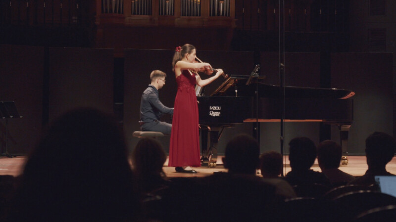
Our classical music students hone their skills until they are ready for their exam recitals. You can attend this joyous occassion, as the exam concerts of master’s students of classical music and composition are open to the public. Postgraduates musical performance practice will also spoil your ears. All concerts take place in our very own MIRY Concert Hall.
 As If More Could Save UsexpoAgendaArtistic activities
As If More Could Save Us emerges from the inhabitation of Curatorial Studies 2025-2026 in Kunsthal Gent. As one of the main partners of Curatorial Studies, Kunsthal Gent has hosted exhibitions from the postgraduate program since 2023. Building on this ongoing collaboration, this year’s exhibition is shaped by the building’s spaces, its internal dynamics, and both existing and new works. It takes place from 29 May to 28 June, 2026.
At the heart of Kunsthal Gent lies the story of Sarah Winchester, the heiress to a weapon manufacturer’s fortune, who relentlessly expanded her house with its endless rooms under the belief that she was haunted by restless spirits. Her house, with its endless rooms, staircases leading nowhere and looping corridors, translates as a ritual of building in response to uncertainty.
Mirroring this spatial imagery, Kunsthal Gent itself reads like a manuscript constantly written and rewritten; a fragmented landscape in which exhibitions unfold over time. After being built as a carmelite monastery in the 13th century, the building which now houses Kunsthal Gent underwent many transformations from opera storage to archaeological museum, and even to a squatting site.
In the spirit of Sarah Winchester, As If More Could Save Us reintroduces a selection of objects from STAM – Ghent City Museum to Kunsthal Gent, where they were previously exhibited during a time when the site still served as an archaeological museum, alongside objects from Huis van Alijn, which enter this context for the first time. Placing the past alongside the present, this ever-changing environment also gains an additional layer through contemporary works by Danai Anesiadou, Pélagie Gbaguidi, Mélina Ghorafi, Leto Keunen, Susu Laroche, Pàpoo Thibau and Julie Vanlook.
By bringing together historical objects, contemporary artworks and the spatial complexity itself, As If More Could Save Us explores how meaning is never fixed but continuously renegotiated. The exhibition builds on this evolving structure. Each space is shaped by what came before; a layering of gestures and intentions across centuries. Things accumulate here, like they always have.
Curators
Eline Adriaensen, Samira Ali Reiza Beigi, Houda Ben Azzouz, Anna Bruni, Cristina Carnelos, Alex Celis, Emma Crombé, Anaïs Du Champs, Tess Ego, Youssef Elkhiar, Zinnia Fay Fay, Nora Franco, Charlotte Frenay, Val Holfeld, Théo Jack Scherer, Bruna Martins, Antoine Meffre Chol, Sutanee Panyajai, and Alice Zitelli.
Supported by
curatorial studies and Kunsthal Gent
Many thanks to
Sonia D’Alto, Laura Herman, Isabel Van Bos and Curatorial Studies KASK Team; Valentijn Goethals, Danielle van Zuijlen, Jana Vasiljević, Tomas Lootens, Aike Roodenburg, Bert Bossaert, Klaartje Van Thuyne, Jens Wijnendaele, Tim Bryon, Mark Kokotov and Kunsthal Gent Team; STAM Ghent and Huis van Alijn.
Lange Steenstraat 14
9000 Gent
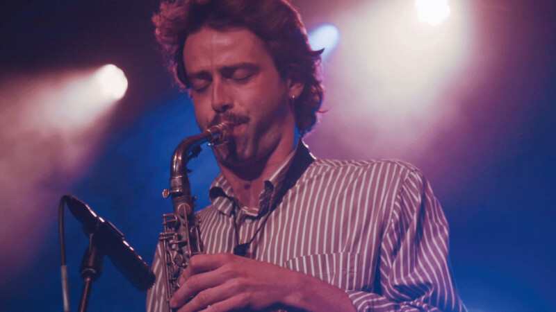
 articleLees, kijk, luistereducationstudent jazz & pop Show us who you are, not what you do
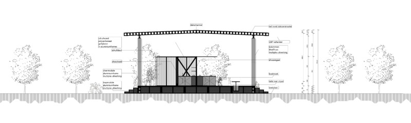
 articleLees, kijk, luistereducationstudents interior design The parasitic pavilion, The inner landscape, The contemporary temple
 articleLees, kijk, luistereducationstudent classical music Two years in Messiaen’s World
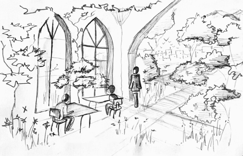
 articleLees, kijk, luistereducationstudents landscape development Could you sketch out your vision for Bijloke 2.0 in 2100?
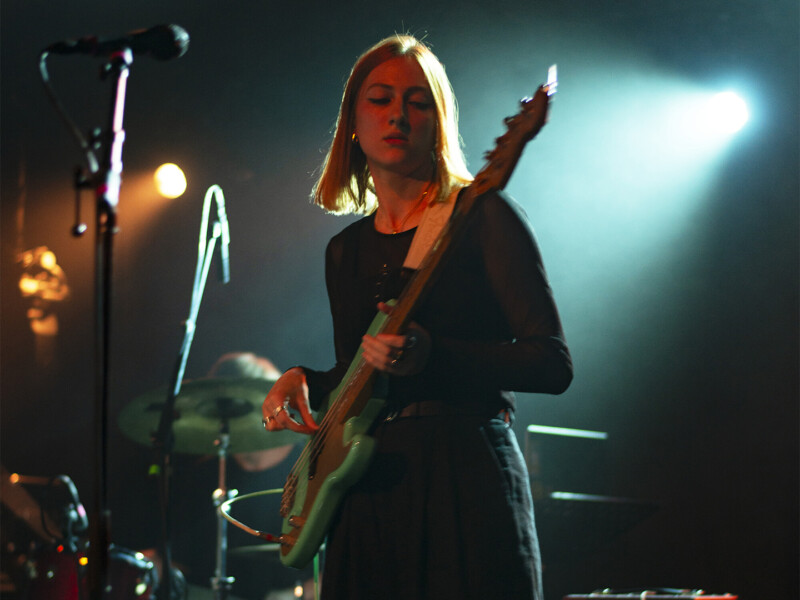
 articleLees, kijk, luistereducationstudent jazz & pop Er was altijd veel muziek in huis
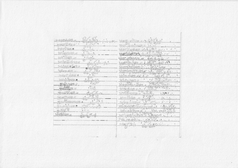
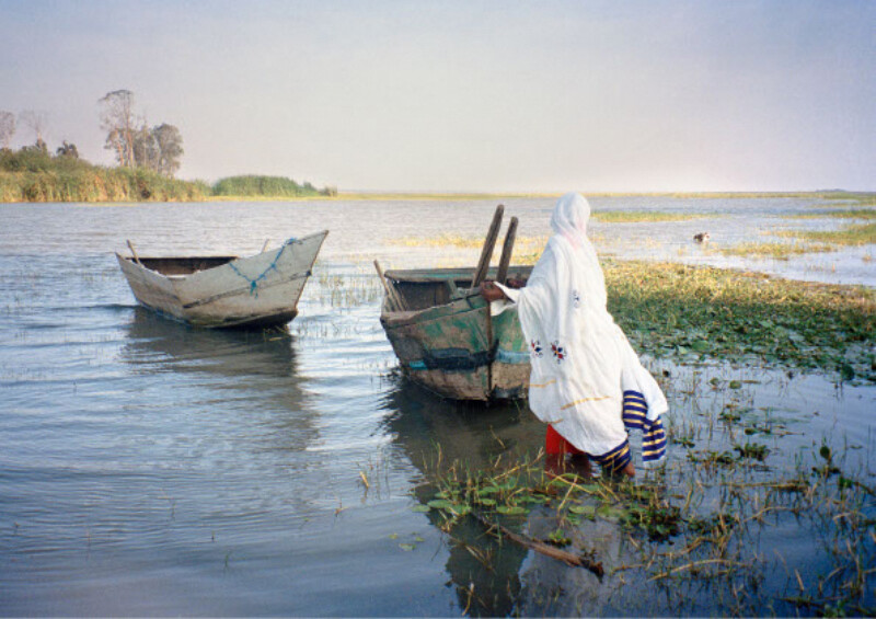
 articleLees, kijk, luistereducationstudent photography እሺ እሺ Eshi Eshi, About the observer
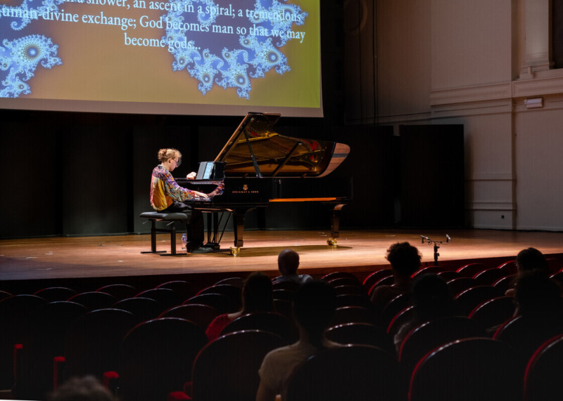
 articleLees, kijk, luistereducationstudent classical music I think music’s most important role is one of connection
 articleLees, kijk, luistereducationmaster instrumentenbouw 19th Century Banjos: S.S. Stewart and Horace Weston
 presentationLees, kijk, luistereducation