The Masque of the Red Death
Rune Callewaert's animated film The Masque of the Red Death derives from Edgar Allen Poe's short story of the same name. Don't be fooled though, narratively Rune gave it his own spin entirely. Although Poe's vibes definitely remain intact.

Arno Huygens
Hi Rune, you just graduated as a master in animation film. Can you tell a bit more about The Masque of the Red Death?
The story begins with a prince in a medieval castle, during an epidemic of the fictional red death in his kingdom. He and the nobility retreat behind the high walls. They merrily throw parties there, thinking themselves safe. A masked guest enters, dressed in a bloodstained shroud. Outraged, the prince pulls off the mask — and there appears to be nothing underneath. The costume falls down and all guest succumb to the red death.
I wanted to do something with that short story specifically, because I have an affinity with Edgar Allen Poe and gothic literature in general. Some years before I started the course, I was already making small animation films, mainly with paper cut-outs. This way, I already made a moving illustration of The Masque of the Red Death. That one snuck into my portfolio during the entrance exam for KASK & Conservatorium.
When I looked for a story to adapt during my master year, that piece resurfaced. It seemed appropriate to complete that circle.
AH
However, in your film there is no castle and we find ourselves in the roaring twenties.
The story has been adapted quite loosely. What mostly remains is a feeling of imprisonment in a decadent atmosphere and of losing yourself. In the outside world, everything goes on, and the setting is a nightclub, not a castle. Then a mysterious guest dressed in red enters. She’s the one that sets the story in motion.
This Red Lady originated from Porträt der Tänzerin Anita Berber (1925), by painter Otto Dix. That, together with Poe's short story, became my starting point for the film. I wanted to visually transport the story to the 1920s because of that portrait. The main character also has an origin in painting, with a striking resemblance to figures by Egon Schiele and — in retrospect — Edvard Münch.
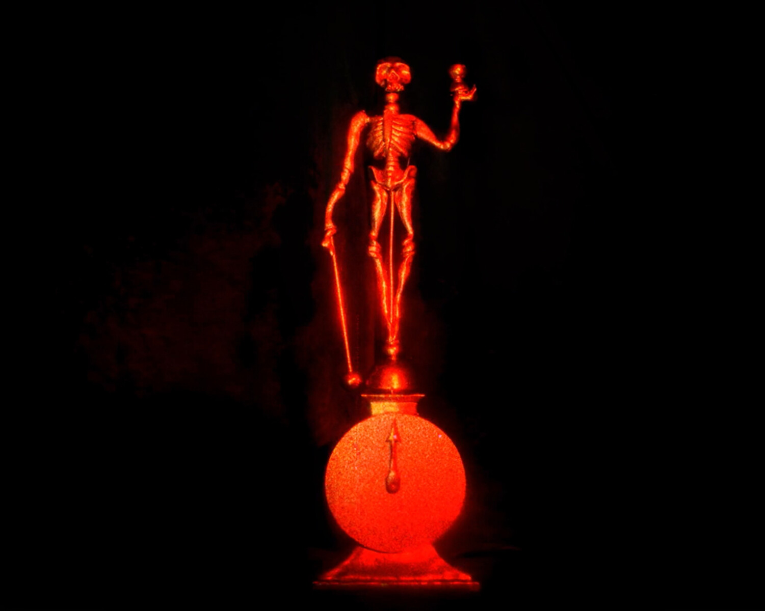
The main character immediately becomes fascinated by the Red Lady. Between them, however, stands the Red Death. That figure too originally appeared in an Otto Dix painting, Der Triumph des Todes (1934). Is it a reflection of the prince's internal world, or rather a tormentor who is plotting something with the Red Lady? The answer lies somewhere between the two, and it was quite alright for me to keep that ambiguous.
The atmosphere of Edgar Allen Poe lingers strongly in there, rather than his story. And of course the soundtrack haunts the whole thing: the Danse Macabre (1875) of Camille Saint-Saëns.


AH
I've taken a peek at your bachelor films, the soundtrack also brings you full circle.
The Efteling theme park used to have a haunted mansion with the Danse Macabre as its soundtrack. That made a big impression on me as a child. I also see such a house as a form of animation, with image and sound. I've carried that composition with me ever since. In other films, I like to hide it as an easter egg. Last year, when the mansion closed after 50 years of faithful service, I made a short film as a tribute.
For my film Aquarium (2023), I also worked with Saint Saëns' Carnaval des Animaux (1886). Now that I am graduating, I wanted to go all the way by adapting his dance of death. On top of being a sentimental choice, it also totally suited the story in terms of atmosphere and theme.
AH
Adapt? How did you go about that?
I wanted something jazzy, and quite a bit left-field. At first I started by looking for music whose copyright had already expired. By the time I had found a Brazilian jazz arrangement of the Danse Macabre, I started to see the limitations of using a bookended piece of music…
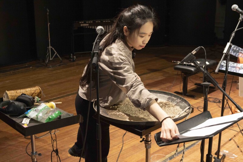
Around that time, I was mixing one of my bachelor films with Patrick Berckx and Els Viaene in the recording studio. It came up that I was not yet satisfied with the music of my master film. Els then referred me to Bart Maris and the improvisation class.
I explained to them that I wanted to include a swing version of the death dance to add a layer to the film. I didn't know what to expect at all at the time, but Bart definitely wanted to try it. To work so freely with an existing work was a bit like swearing in church, especially for classical musicians.
The first time — they organised two sessions — it was not 100 per cent what I wanted. In a second session, we added brass players. Trumpeters in particular were missing from the first session. That was immediate magic. I didn't expect it to so quickly sound like what I had in my head.
The first session sounded a lot calmer than the final product. We still managed to retain a piece of it though. There is an interlude in the middle of the film, in which we stop following the main character for a while. As a scene between two gamblers gets out of hand, the music turns to solo piano.
The whole thing resulted in a silent film, in colour. I did provide intertitles to add a bit of clarity to the rather cryptic plot. And then Bart and the improvisation class, provided a soundtrack that propelled the whole thing. Through them, I then came into contact with Jolan Decaestecker, a music production student, who then mixed the music.
AH
What came first, music or film?
The music and the image took off like two parallel trains, that synced their routes along the way.
When the music was recorded, my orchestra already existed as puppets. A jazz ensemble as you would see in photographs or prints of the time. The sound naturally had to match that. I gave the musicians some initial stills to bring them into the atmosphere of the film.

AH
All the characters are puppets, how did you bring them to life?
I like to combine media. During the bachelor, I made a film with green screen, on which everything was composed afterwards. I only captured the puppet on camera. I very much enjoyed seeing where that took me, and how it still left room to add a things in post.
This film, however, was shot almost entirely directly into the camera. That choice was meant to enhance the historical character — and I really wanted to look for a specific spatiality. Only about two shots were heavily edited afterwards. For the dynamic scenes of doors opening and closing, for example, I had to layer several shots.
The first frame just has to be right, purely in terms of composition anyway. Once the first frame is fixed, then the animating starts. That process is very slow, so you can make adjustments as you go along. If a puppet is too close to the camera to extend a right hand, for example, you use the left arm — or you make two movements. That extra movement keeps the audience’s eye engaged. And that way, the puppets seem even more alive.
Those figures are between 20 and 25 centimetres tall. I wanted them to drown in the sets. Originally those were supposed to be even bigger, but that quickly cramped up my workspace. I wanted to put something together that could be really overwhelming at times.
AH
You definitely recommend seeing it in the cinema, then?
Definitely! For the first time, I really made the film with cinema in mind. So while editing, I used a 4:3 ratio. Partially because I saw that my original shot was crammed with busy compositions. That 4:3 ratio made my image much calmer — a true kill your darlings moment. After the jury, I also cut out about two minutes, to really cut to the core. At the previews in Sphinx Cinema, it was wonderful to see that come together.
Text: Arno Huygens


